The Big Picture
19 Apr 2011I'm frequently exploring and evaluating new products. It is part of my job. The information overload is huge and it is important to know where not to look, how to quickly rule out products that are not worth looking at. I'm also reviewing architectures and design, consulting, commenting, advising and maintaining architectures. During the years I've noticed that it is quite easy to roughly evaluate a system by just looking at few places.
The first place to look is a web page section called Architecture or System Overview. If there is no such page or document, you can be pretty sure that the system is using a popular and well-established big ball of mud architectural pattern. Looking anywhere else is just a waste of time. The option you have is to try the system for yourself or look at the sources. But that's very time-consuming and usually the result is not worth the effort. Scratch such system.
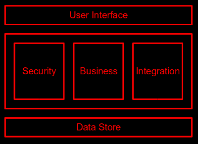
If you have found the architectural description, it is usually not worth start reading yet. Just skip ahead and look at the first figure in the document. It usually looks like the "diagram" below. What does this creative depiction tells about the system? Well, it is a three-layer system. Or at least that's what the architect meant. There is a bunch of stuff in the middle layer, but the picture does not provide any information about the structure inside. Dependencies are not shown so system maintainability is unknown. Interfaces are not even hinted, so there is probably no interface at all or there is a jungle of competing and redundant interfaces. The system structure may not be set yet. Or maybe the architect does not understand the system to draw a better picture. Or maybe the team is afraid to show the structure to the public. None of that is a good sign. The arguments that "we don't want to clutter the picture with too much details" is usually just an excuse. Reading through the text is mostly a waste of time as it will most likely be just a marketing-oriented nonsense (MON). If there is no better figure anywhere nearby the best strategy is to ... run away.
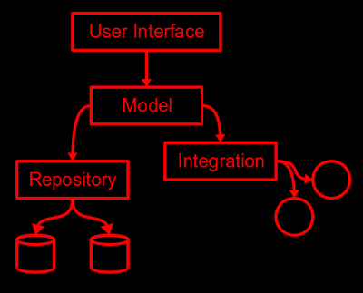
If there is a picture similar to the following one, you are almost there. The system is a good candidate for further exploration. Such picture gives a reasonable level of details and indicates that the architect has quite a clear idea about the system structure. It is not just the form itself, it is the content of the diagram that you should focus on. Look at the figure below. You can see that there is a Repository component. Two data stores below indicates that the component is supposed to act as an abstraction for various data storage mechanisms. Although it is not shown in the picture, you can pretty much expect an interface on top of the Repository component (and other components as well). Similarly with Integration component. You can also see that similar approach is used for two subsystems (Repository and Integration) unified by a common Model component. User interface is placed on top of Model, which clearly isolates it from the low-level details. The most important dependencies are shown in the diagram which provides some hints about maintainability of such architecture. You can get quite a good idea how such system works by just looking at the diagram.
Now it is the right time to read through the text and other documents. Look especially for explanation of motives, not just the structure. For example, look for an explanation of reasons that the Repository and Integration components are not unified into a single component. That gives confidence that the team actually though over several alternatives before committing to current architecture. Look for links to papers, books and other sources. That gives a hint that the team spent some time "in the library" instead of trying to save time by blindly re-inventing things in the laboratory. Especially look for buzzwords. If find a buzzword used without a deeper explanation of motives it is a serious warning sign that the architecture may be buzzword-driven and therefore not sound. Look also at hints that the architecture was done all the way down. That means that the architect thought about deployment and usage of the system. Presence of an deployment diagram or a typical usage scenario is a good sign that this happened.
It is a curious thing how much can be learned from a single picture. The picture is really worth a thousand words.