How To Make Technology Presentations
Technology presentations are fun. But they can also be hard, especially for people with limited presentation experience. Whether they are fun or hard (or both), technology presentations have some very specific features.
There is a lot of guides out there that can teach you how to make a good business presentation. But let’s be honest, technology presentations that are prepared in business style are bad. Really bad. They are boring, the information is diluted to homeopathic levels and there is a strong scent of a sales pitch. We are engineers. We can do better than that. And that is exactly what this guide is all about. It will show you how to make good technology presentation.
Before You Begin
There are few things to consider even before you create the first slide.
Do not skip this part of presentation preparation. The things that you do before you lay down the first slide have more influence on quality of your presentation than all the other things combined.
Audience
The most important aspect to consider is the audience. Who will be listening to your talk? Will there be fellow engineers? Or will the room be full of managers in suits and ties? What is the skill level of the audience? Do they specialize in your topic? Or is your topic completely new to them?
Those are critical questions to prepare your presentation. If you make presentation too difficult to the audience to understand, such presentation is pointless. If you make presentation too easy, the audience will get bored and they will not pay attention. You have to set the "difficulty level" of the presentation just right.
The most difficult audience is a mixed one. Unfortunately, that is also the most common audience. There are likely to be few experts in the room. Most people probably heard about the thing that you are presenting, but they do not know the details. And then there will be bunch of people that have no idea what you are talking about.
Therefore most presentations start with a brief introduction to the topic, a "lead in". This levels the playing field and brings most of the audience to the same basic level of understanding. This may be as short as a single slide that sets the context. Or it may take better part of the presentation. One way or another, most presentations will include an introduction. Your first task is to guess what kind of audience you will be talking to and plan appropriate "lead in".
Also, you have to admit that you cannot make the presentation suitable to everyone in the room. There will always be people that will not be able to understand. It is sad, but it is inevitable. Do not dilute or "dumb down" your presentation in an attempt to make it suit everybody. If you try to make the presentation for everybody, the result will a presentation for nobody. You will not be able to explain the topic to the people with no background or interest in the time that you have. And in you will bore the rest of the audience to death if you attempt to do that.
The last thing to consider about the audience is the cultural background and capabilities. Are they native speakers of the language that you will be using? If there is significant number of non-native speakers, adapt your presentation to them. There are few simple things that you can do. Do not rely on your vocal expression to deliver the message. The audience may have trouble to understand you, especially if you have stong accent. Try to write most important messages on slides. The audience may read the message instead of listening to it. This is also important for people with hearing problems, or in case that there is a lot of noise in the room. Also, try to use simple language. Explain the same thing using diffent words and phrases. And avoid jargon or unusual idioms. Your audience will appreciate that.
Message
What is the purpose of your presentation? Do you want to teach audience something? Are you sharing your experience with community? Do you want to persuade them that your idea is good to gain support? Are you informing the group about your progress? Do you want them to join you and help you? Or are you just proud about your success?
This is the most important consideration about your presentation. It is the make or break moment. You should be very clear about the purpose of your presentation before you start working on it. Do not lie to yourself. Admin the true purpose of your presentation to yourself. Even engineers need to sell things and ideas from time to time.
Your message should be simple. Ideally, you should be able to summarize it in one short sentence. If you need more than that, your message is probably to complicated to be conveyed in a presentation. Try to simplify it. Focus only on the essential part.
There should be one primary message in your presentation. Optionally, there may a couple of secondary messages. But not more. Avoid the temptation to say too many things. That will only confuse the audience. Make the presentation focused on the primary message. Make sure the primary message is understood by vast majority of the people in the room. Some people may also get the secondary messages, but that is just a nice bonus. Design the entire presentation with a sole purpose to convey the primary message.
Length Of Presentation
You cannot just talk and talk and talk all day. There is always a time limit for a presentation that you to fit into.
Try really hard to keep the time limit of a presentation. It makes no sense to prepare 60-minute presentation when you know you have only 45 minutes including discussion.
Prepare appropriate number of slides for your presentation. It makes no sense to prepare enormous slide deck if you know that you only have 30 minutes. You will have to skip every other slide, which will only confuse the audience.
It is difficult to estimate the right number of slides. There is a wild variety of presentation styles. Some slides are shows for minutes while other slides won’t stay on for more than a couple of seconds. Estimating the number of slides is somewhere between an art and black magic. But there are some rules of the thumb to start from.
The usual average slide takes approximately 2-3 minutes to present. I usually do not count title slides, final slides with contact information, presentation "chapter titles" (if they are used) and similar service slides. I take just the slides with real, tangible content. Multiply the number of slides by 2-3 minutes to get something like this:
| Net talk duration | Usual number of content slides |
|---|---|
15 minutes |
5-7 slides |
30 minutes |
10-15 slides |
45 minutes |
20-35 slides |
60 minutes |
35-45 slides |
This applies to the "usual" presentation, with slides prepared according to the guidelines below. The duration is a net duration, the time you will be actually talking. This much shorter than the actual time slot that you are given. You have to allow for a minute or two at the beginning for introduction (e.g. introduction by a moderator), potential problems microphone, projector or similar "overhead". You have to allow for appropriate amount of question & answers and discussion after the presentation. Also, adjust the numbers according to your presentation style and audience. E.g. if you like to take questions and discuss the matter during presentation, you should reduce the number of slides. Therefore it is quite usual that 45-minute time slot will give you less than 30 minutes for presentation.
Do not try to squeeze in more content into presentation by planning to talk quickly. This will not work, and it will completely ruin your presentation.
Never ever exceed time limit set for your presentation! It is disrespectful even if it is not done on purpose. To do it on purpose is outright rude! Just don’t do it. Shorter presentation is always better than a long one. When in doubt, reduce the number of slides or move them to "backup slides" section. If you end your presentation early there will be more time for discussion!
The number of slides is an effective way how to control the length of your presentation in a very natural way. If you get the number of slides right and you get some practice, you probably won’t need any other method to control length of the presentation. You won’t need to watch your time and your presentation will end right on time. This requires good preparation and some discipline, but it is my favorite method.
Lightning Talk Paradox
The shorter the presentation the harder it is. Short presentations require a lot of preparation. In fact, it is often easier to prepare a two-hour lecture than a to prepare a 5-minute lightning talk. The difficult part is to figure out how to express your idea clearly and consistently in such a short time. It is an idea, not ideas. Short presentation must be focused on one thing and one thing only. These are very hard to do. It is likely you will need days for preparation.
Presentation Structure
Every presentation needs a structure. Even a short lightning talk needs introduction, body and conclusion. However, the longer the presentation is, the stricter the structure needs to be. Without a structure, you are going to lose your audience in an information maze.
Good presentation should be like a good story. It should have introduction, body and conclusion. You want to lead your audience through the presentation in a very natural way. You want to introduce your audience to the topic and stimulate their curiosity. Then you want to get to your point and deliver your message. And finally, you want to wrap things up.
Introduction and conclusion may be simple and short. It may be no more than just a couple of sentences. Maybe you will not need any special introduction of conclusion slides at all. But an introduction and conclusion should always be there.
Following sections provide a description for each part of the presentation. This description is focused on slides, as the slide deck is the best navigator - both for you and the audience. It helps you to keep the presentation on track. It helps the audience to make sense of the things that you are talking about.
The structure described below assumes that you are preparing a very ordinary presentation that takes 30-60 minutes. Those are guidelines, not laws. Feels free to adjust them as necessary.
Title Slide
Every presentation starts with a title slide. You may thing that title slide is simple, trivial and boring thing. But that is definitely not the case.
The title slide is all about first impression. The slide will be most likely shown before you say your first word. Importance of first impression can hardly by overstated. Overall "feel" of the title slide is a significant factor in the impression that you are going to make.
The title slide also sets the atmosphere for the talk. Make it look elegant if you want to look professional. Make it look extravagant if you intend to deliver a disruptive talk.
Yet, the title slide is not all about emotions. There are rational things that you should consider. Good title slide should contain following information:
-
Presentation title and subtitle.
-
Name of presenter and, optionally, a job title or relation to the topic of presentation.
-
Affiliation, such as company name, organization or club that you represent (if not obvious from slide design).
-
Event name and/or place where the presentation was presented.
-
Date of presentation. Date is extremely important, even though it is often missing.
Title slide is not just like a book cover. Title slide has its purpose. It provides metadata. It does not show just what the presentation is about, but also whe, where and why it was presented. In that aspect, title slide is more like a book colophon.
Make the title of presentation short, not more than a few words. If you need to be more specific, add a subtitle. Subtitle can be longer, you can easily get away with a dozen of words.
If you plan to publish the slides, do not forget the date. Date is one thing that people often miss on a title slide. However, date is important to properly place your presentation in the future. People are going to find your presentation many years and even decades after you have presented it. The things will be different at that time. Your presentation may look old-fashioned, outdated and maybe even dumb. Having a date on a title slide where everybody can clearly see it will help to properly place information in your presentation.
Figure 1. Bad title slide
This is as bad title slide as it gets. Almost everything is wrong. There is no author information, no date, no nothing. The title of the presentation is ambigous. Even the graphical side of the slide is wrong. Company logo and the fancy background attracts almost all the attention, no attention is left for the important parts. Even though it does not make much difference here, as all the important parts are missing.

Figure 2. Good title slide
This is an example of good title slide. There is presentation title and subtitle. We have author name, event name, date, location is implied, and so on. There is company logo and some fancy corporate graphics, but it does not take too much attention. Of course, even this slide could be improved. But it is more than acceptable title slide.
Personal Introduction Slide
Sometime it may be a good idea to add a slide with a personal introduction to your presentation. This is useful if you are presenting to the audience that does not know you. Personal introduction is especially helpful if you are presenting subjective opinions, or if you rely on the audience recognizing your credentials as a subject matter expert.
The obvious inspiration to the personal introduction slide is a business card. You should state your name, usually accompanied by academic credentials, affiliation and job title.
However, you have more space here than you have on average business card. Therefore, it may be a good idea to add your photo. Clearly, the photo is not important for the people that are in the room with you. They can see your face already. But the photo is a nice addition for the people that will check out your slides after the presentation.
You should also add a couple of credentials that are relevant to the subject of your presentation. Are you a developer of the software that you are presenting. Put that down on the slide. Have you published a book about the subject. Put that down. Give the audience reasons to trust the things that you are going to present. However, be brief. Select only the facts about you that are relevant for the topic. Be modest and do not make it larger-than-life. The most impressive aspect of the presentation should not be you, it should be the information that you are going to present.

Figure 3. Good personal introduction slide
This is an example of good personal introduction slide for an academic lecture. There is a name of the presenter. As this is an academic lecture then there are also academic titles included. Business presentation would probably omit the titles. Although I have enough credentials to fill several slides, I have selected only a handful of credentials that are relevant to the presented topic. The important keywords are emphasized to attract attention.
Agenda Slide
You should prepare your audience for what is going to happen during the presentation. Agenda slide is usually a simplified "table of contents" of your presentation. However, there is more to the simple agenda slide than it may seem.
The purpose of an agenda slide is to set the frame for your presentation. It should work like an appetizer. It should provoke the curiosity of the audience. Therefore, do not spoil your presentation with an agenda slide that is too detailed.
Ideally, agenda slide should be very simple. There should be no more than 3-5 items. Each item should be just a couple of words.
Just keep in mind that agenda slide is completely optional. If your agenda slide essentially says just "Introduction", "Body" and "Conclusion", it would be better to delete that slide. Also, skip agenda slide entirely for short presentations. There is no point wasting the time talking about something that you are going to say again in a couple of minutes. And do not even think about agenda slides for presentations with wild/unusual/unique structure. You are not going to spoil the fun, are you?
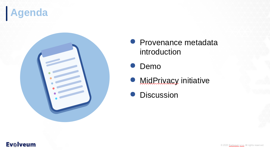
Figure 4. Good agenda slide
This is a nice little agenda slide. It has just a few bullet points to show what the audience should expect in next hour or so. It says "Introduction", but it also adds what exactly will be introduced. There is a point saying that there will be demo. Although I do not usually like fancy corporate clipart in technological presentations. But this one is quite acceptable. The picture of a clipboard is a nice illustration for an agenda. And it fills a space that would be left empty anyway. The slide can still be improved, but it is good enough even in this form.
Figure 5. Bad agenda slide
This is a really terrible agenda slide. There is too much information, the agenda it too detailed. This means that the text is too small and difficult to read, especially on this inverted backgound when presented in a room that is not completely darkened. This is made worse by aligning everything to the left-hand side. Infantile title graphics crowns it all. Perhaps the only good thing about this slide is that the content is most likely honest. However, what this slide tells the audience is this: "Try to leave the room as soon as you can".
Lead In
It is not realistic to expect that everybody in the room will be an expert on the topic that you are going to present. Quite the contrary. It is very likely that there will be people in the room that never heard about the things that you are going to present. You should create some slides to lead the audience into the topic of your presentation. Set the stage, provide context, bring the audience closer to understanding the foundations under your talk.
Try to keep the introduction simple. Use simplified explanations, avoid unnecessary details, focus on principles. Use analogies that are simple to understand. The purpose of the introduction is not to make everybody in the room expert on the topic. The purpose is to give the audience just enough information to understand the rest of your presentation. Therefore resist the temptation to teach and preach. Keep the introduction short.
Unless your presentation is very special, this introduction should never exceed one third of the presentation size. And usually it should take just one quarter or less of presentation time. In fact, you should not could to spend more than 10 minutes on introduction, no matter how long your talk is. Otherwise the experts in the room will assume that this presentation has nothing to tell them and they are likely to leave or tune out. Which means that you will lose the most valuable part of the audience right at the beginning.
This gives you room for just a couple of slides for introduction, perhaps 2-5 slides. Think about the most important things that the audience needs to understand in such a short time.
Body
This is the point where things get serious. The audience should be prepared to hear and understand what you are about to say. Even the experts in the audience should learn something new at this point.
You are making technological presentation. Therefore it is likely the thing that you are trying to say is quite complex. The best approach is to start with something simple. Perhaps you can simplify your case by leaving out some details, removing variables. When you think the audience understands the simple case, add complexity. One aspect at the time. Go from simple things to complex things.
Use diagrams as much as you can. Picture is worth a thousand words. However, in technology it is often more like a million words. Use colors, arrows, even animations (but not too much).
Diagrams are useful, but keep them clear and understandable. Each diagram should show just one thing. If there is a diagram with too many details, show the same diagram on several slides. Each slide should highlight the important part relevant to one single idea or case. Or maybe the other way around: hide the parts that are not relevant. You should take the time to "walk through" the audience through complex diagrams that cannot be divided.
You may want to split this part into several sections. Especially if you are delivering a long lecture. Add special slides to divide the sections. These may be just slides with section title on them. But it may be a good idea to show an agenda slide instead, with the current section highlighted. This works like a progress bar, it may make your audience more patient.
Do not go too fast. Make sure the audience has enough time for the information to "sink in". Try to get some feedback from the audience. In fact, you should be able to watch for feedback during the entire presentation, but this part is critical. Make sure the audience understands your primary message. Feel free to go back to previous slides if you see puzzled looks in the audience. Explain the point again, using slightly different words.
This is the core of your presentation. If your message does not sink in then everything is wasted - your preparation, your time, and especially the time that your audience spent listening to you. Make it worthwhile.
If you are running out of time, the best approach is to skip the complex slides. Do not try to speed up your presentation. That will not work. If your audience had problems understanding the simple slides at slow speed, there is zero chance that they are going to understand complex slides at high speed. Just skip the slides and jump right to conclusion.
Conclusion
... and they lived happily ever after.
Every story needs a good ending. A good ending for a talk is to re-iterate over the most important things that you have said. This helps the audience to remember the information that you have provided. Summarizing the information in a simple form also improves overall impression the audience gets from the presentation.
The conclusion should not be the same as agenda slide. Agenda should provide an overview of the talk and stimulate curiosity of the audience. Conclusion is different. The purpose of conclusion is to improve retention, especially retention of the primary message of your presentation.
Keep conclusion simple. Really simple. Having three short bullet points is just about right. Make sure the conclusion contains your primary message. The primary message may be shown in indirect form, it may be simplified, but it should be there. Clear and simple, for everybody to understand.

Figure 6. Acceptable conclusion slide
This is slightly strange, but still acceptable conclusion slide. It places emphasis on product name (midPoint). The bullet points below that are probably a bit longer than necessary. But overall, this slide summarizes the presentaion quite well. When accompanied by the right words, it can conclude the presentation nicely.
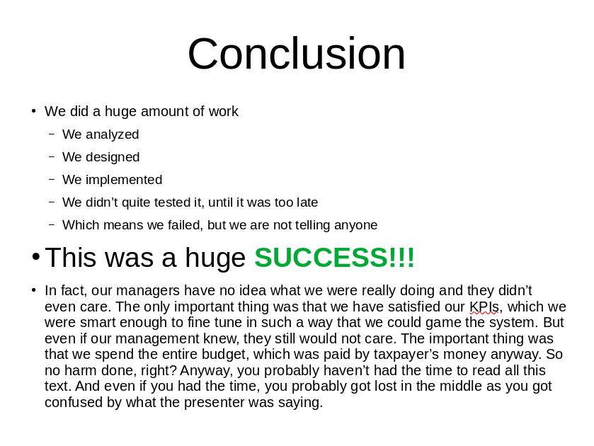
Figure 7. Bad conclusion slide
There we have it. The worst conclusion slide ever. There is just too much information, and too little information at the same time. The volume of information is huge. However, the information is vague and the structure is all wrong. It does not really tell anything. There are conflicting messages (SUCCESS and failure). There are mixed font sizes, colors and just too many exclamation marks. And then there is this one big long text. This slide may get some points for being honest, but otherwise it fails on all fronts.
Questions/Discussion Slide
I like to have one empty slide with one big question mark right before presentation end. Or maybe you would better like big "DISCUSSION" or "Q&A" slide. It is completely optional, but it helps me to remember about asking the audience for questions. I usually instruct the audience to ask questions anytime during presentation, which leads to interesting discussions. But that means I tend to forget to ask audience whether there are any questions one more time at the end. This slide makes me remember.
Figure 8. Big question mark slide
This is a slide that I like to put in just before end of presentation. There is really no need for anything more.
End Slide
The End
You are done. Now it is the time to thank your audience for their attention and time. I like to have a slide dedicated for that at the very end of presentation.
The slide can also contain your contact information, such as e-mail address. You can also provide links to your website/blog or your e-mail address, twitter handle, etc. This slide is like an implicit call to action to follow up the conversation.
I find useful to include a link to list of my other presentations (see below). Which is also a link where the audience can find the slides that I’m just presenting.

Figure 9. Simple end slide
This is a simple end slide. It repeats presenter name for those that have forgotten it during presentation. It provides a pointer to further information. Minimalistic and sufficient.
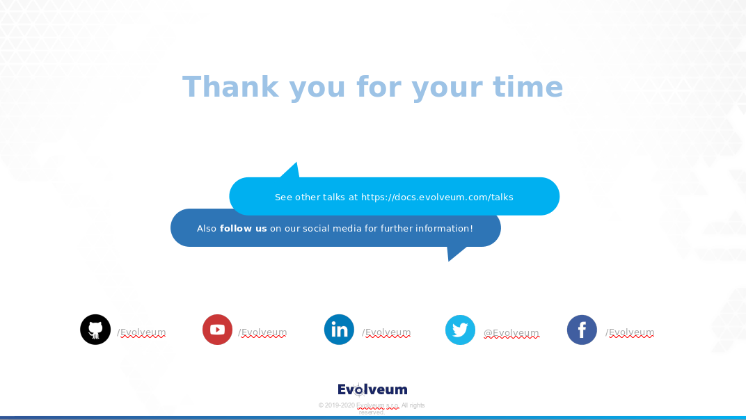
Figure 10. Fancy corporate slide
This is a fancy slide in a corporate design. It is perhaps too fancy for technology presentation. But it is still acceptable, even though it has its problems. There are all the information that audience would need: point to more talks, social media links and so on. But that is perhaps the problem. There is too much information and the audience may be confused. When the presentation is live, this slide is shown for no more that a couple of seconds. Therefore the audience does not even have a chance to read the small text in the middle (which is way too small).
Backup Slides
Most presenters of technological presentations wish that they would have more time available for their presentation. This usually means that they would need at least a couple of hours to present what they want to present. Despite that, it is absolutely essential to keep your time slot.
However, there is often discussion with the audience, either after the talk or even during the talk. You may expect that audience may be interested in particular details of your talk. You may want to present additional data during discussion. Therefore I usually find it useful to prepare a couple of "backup" slides. Those are often slides that just do not fit into my time slot. Or diagrams that I expect may clear some misunderstandings during discussion. You may also figure out that you have not estimated your audience well and you need to switch your talk to a more basic or more advanced mode. Backup slides may be useful for that as well.
Backup slides may also come handy in case that there are no question in the discussion section and there is an awkward silence. The best strategy at that point would be to end the presentation. However, if you really need to fill the time, backup slides may help you.
There is one huge benefit to creating backup slides, even if you are never going to use them. Most of us have a tendency to create presentations that are too long. We often have to re-iterate over the slide deck when it is finished and delete slides that just cannot fit into our time slot. It is a sad moment to delete a slide, especially if it is a nice diagram that took a lot of effort to prepare. Moving such diagram to backup slides instead of deleting it may be much easier to do.
However, resist the temptation to present backup slides if you do not need to. They are just for backup. Use them only if there is an interest and you still have the time. Strictly keep your presentation within your time slot.
Slide Deck
We know what we want to have in our presentation and how we are going to structure it. Now, let’s talk about how to present it. How to create slides that look good, slides that are readable, understandable and pleasant.
T-Shirt Rule
A slide should contain as much content as you would put on a T-shirt.
This is perhaps the most important rule. Do not overload your slides with text, pictures, block and arrows. Use short texts and simple pictures as much as you can. Try to focus attention of the audience on one simple thing on each slide. If your slide is too complex, consider splitting it to two or more slides.
Simple slides are always better than complex slides. Slide that has just a couple of words in a big font is perfectly fine. Slide that contains just a single photo can be impressive. We see that all the time in TED talks. Yes, yes, we are not giving a TED talk here. It is not always possible to simplify things to the extremes in technological presentations. But we should try to do our best.
Texts
Unless you are doing a very unusual presentation, there will be a lot of texts on your slides. The first thing to always keep in mind when creating slides is to keep it simple. Keep the texts as short as possible. But when it comes to texts, there are more things to consider.
The most obvious one is text font. Sans-serif fonts (Helvetica, Arial) usually look much better than serif fonts (Times New Roman) in presentations. Do not get too fancy with fonts. Simple, elegant font is usually a best choice. Comic sans, although it is a sans-serif font, is usually not a good choice.
Use font of appropriate size. Never use small font sizes. Font size of 18, 22 or bigger are fine. Never use font size 12 or less. Perhaps except for disclaimers that your legal department insists on having in the presentation. Maybe small fonts are good for creative context illustrations and similar things. But never use small fonts for anything that you expect the audience to actually read.
No, "but people will see my presentation on-line, I’m fine with small fonts" is not an excuse. Small fonts are difficult to focus on, even if you can see the text clearly. And no, "I want the people to understand my slides even if they do not hear me talking" is not an excuse either. If you expect that people will just see the slides and you want them to understand everything then you do not need a slide show. You need an infographic. Or a paper or a book. You are creating presentation to present it. It is an audio-visual thing. Never use small fonts in presentations.
You often need to add some emotion the texts. This is presentation, you should work emotions with your voice. But having a visual stimulus to supplement your voice is nice. Emotion is usually added to the text with font variations such as bold, italic, underline or by changing font color. Any of these is fine. Just keep it simple and consistent. Choose one style for emphasis (bold, underscrore, color) and use it everywhere. Do not mix the styles. Italics is fine to highlight terms. Teletype is good for literal values. That is OK. But do not use those for emphasis. Choose one emphasis style and use it consistently.
Presentation is a free-form thing, therefore you do not need to strictly stick to grammar rules. It does not mean that you do not need to check your spelling. But you do not need to care about proper capitalization, commas, ending sentences with a dot and so on. You can be creative. Just be consistent. If you do not end texts in bullet lists with a dot, avoid using that dot everywhere. Make sure you capitalize all your titles in the same way. Align your styles in the entire presentation.
Finally, there is one very important rule: avoid long texts. This is a presentation, not an academic paper. Long texts are major distraction. The audience will either pay attention to what you are saying or read the text. Most people cannot do both at the same time. And the big text right in front of their eyes will usually win this duel. Which means, people will not pay attention to you. You do not want that. Just avoid long texts. Always.
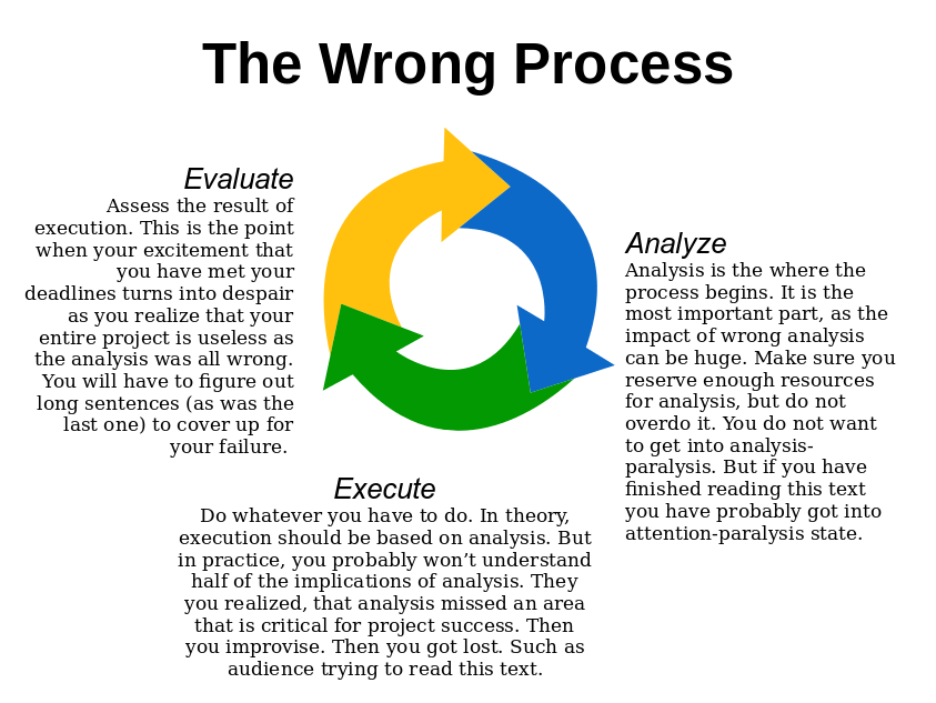
Figure 11. Slide with long texts (bad)
This slide may look quite good. But it is not. The most obvious problem is the long texts. Even if you provided that for "off-line" audience and you do not want the audience to read them while you are talking, they will try to read the texts anyway. The texts are too small, audience will have problems reading them. You will be talking about the evaluation step, while audience will still try to finish reading about the analysis step. Your talking will avail to nothing. Avoid long texts.
If you really want to include long explanations, create four slides instead of one. The first slide will provide an overview of the process with just three words: Analysis, Execution, Evaluation. Following three slides will each focus on one single step of the process. I would still advice to avoid long texts even on these slides. But it if you really have to do it, separating the slides reduces the chance that the audience will miss important information.
In addition to that, this slide is a typographical eyesore. There are mixed sans serif and serif fonts. Bold and italics is mixed for emphasis. Each text block has different alignment. The texts are too close to the picture. It is all wrong.
This is how the slide can be improved:
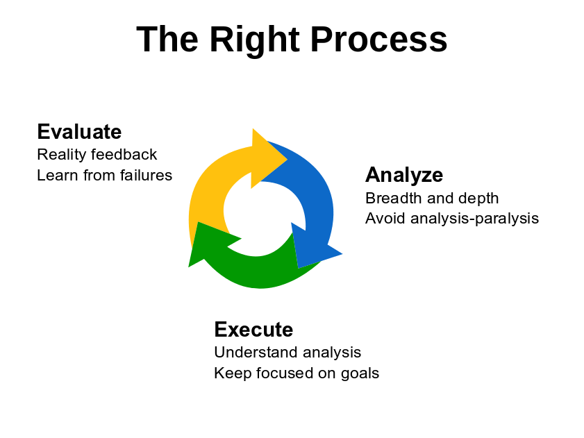
Figure 12. Improved slide
Texts are much shorter. In fact, they are not really texts, but rather just a bullet points. The same font is used everywhere, bold font is used for emphasis everywhere. Fonts are larger for better readability. It would be nice to further reduce and refine the text. But even this slide is acceptable. It can still be improved, especially proper placement of the texts relative to the picture, centering, overall "balance" of the slide and of course adding some background. But this slide is a good start.
Bullet List Styles
Bullet lists (outline) are the most useful mechanism for presentations. They are often considered to be old-fashioned, not fancy enough for presentations any more. Indeed, if you have weeks of time available to prepare your presentation, you should probably avoid the use of bullet lists as much as you can. But we are engineers, we most likely do not have the luxury to play around with our presentation for several weeks. The most likely situation is that you have only one day, or even just a few hours to put your presentation together. Chances are that your presentation is tomorrow morning and you have to choose between good slides and good sleep. In such cases the bullet lists are your best friends.
Bullet lists can be prepared quickly. Yet, that does not mean that you must put down the first thing that comes to your mind. Think what you want to say on this particular slide. Think about the important parts of your message. Put that into the bullet list.
You do not need to put complete sentences in the bullet list. Even single words are fine. Try to reduce the information to the very minimum.
Short bullet list would be a single-level list with 3-5 bullet points. That should be your primary tool. Like this:
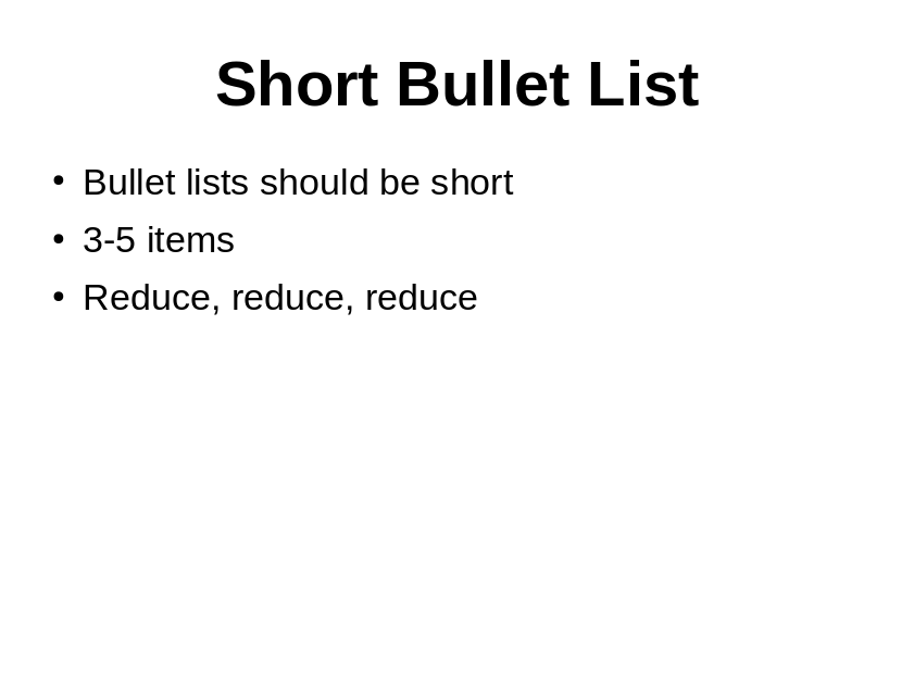
Figure 13. Short bullet list
If you want to express more details, use a two-level list with 3-8 top-level bullet points. Then add the details in a second-level list. Like this:
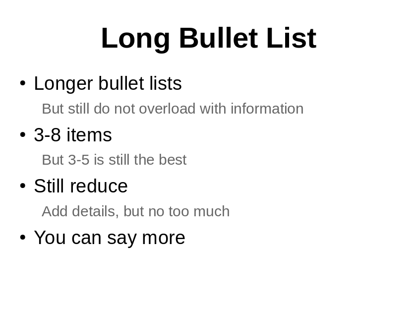
Figure 14. Long bullet list
This is my favorite style. My presentations are a bit on the thick side. As this guide is all about technology presentations, yours presentations may be similar. There are usually a lot of details to share with the audience. It is easy to forget mention some important things. The bullet lists are creates as much for the audience as they are for the presenter. Even if you forget to tell about some detail, it will be there on the slide. The audience may still catch it.
I like to avoid using any bullet character in the second level of the list. I like to use smaller font and lighter color for the second level. The intended effect is for the first-level of the list stands out at the first sight. I like to motivate my audience to look at the first-level items first to get some overview. And only then delve deeper into the details.
However, do not overdo it. Do not add too many details. Otherwise the result will look like this:
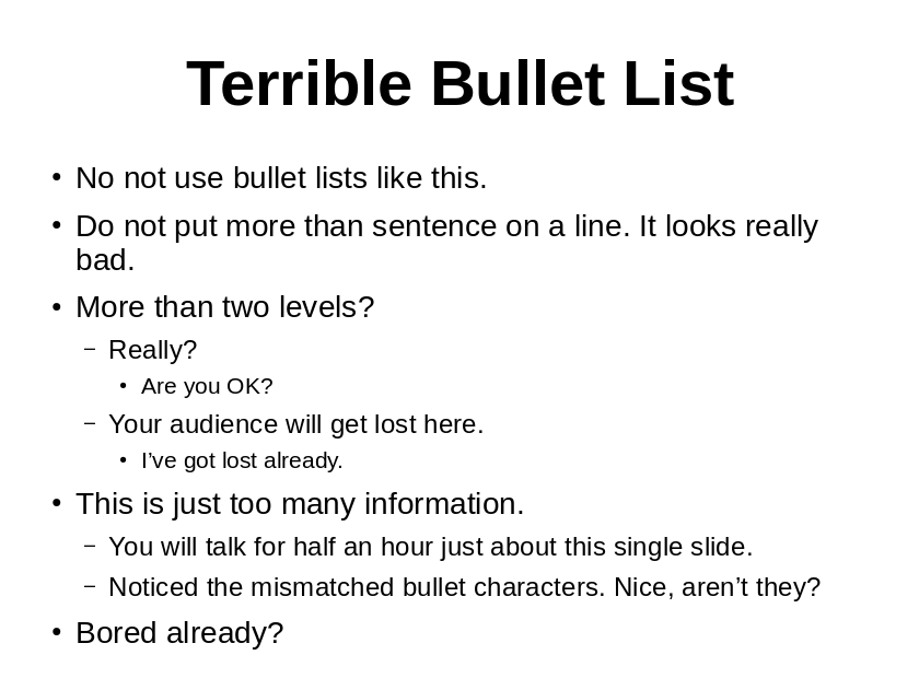
Figure 15. Terrible bullet list
Do not use more than two levels. Make sure bullet characters are aligned (or not present at all). Avoid multi-sentence statements in the list. As always, avoid long texts altogether. And try to reduce the amount of information as much as you can. If you cannot avoid very long bullet lists, then you are perhaps trying to present too much on a single slide. Split that slide to two (or more) slides.
Make sure you have correct styles in your master slide. It won’t work if you need to set up styles for every individual list. Do not do it, do not change the styles directly in the slide. Set everything up in the master slide.
Construction of bullet lists is easy. It takes just a fraction of time when compared to fancy, creative and colorful slides. Bullet list is a very efficient tool. Yet, that means that modification of bullet lists is also easy. You should look at your slide when you think that it is finished. Try to improve it further at that point. Try to delete details that are not necessary. Try to shorten long statements. Try to re-word things that are difficult to understand. Try to re-order or re-structure the list. Take the time to fine-tune it. It is a worthy investment.
Diagrams
A picture is worth thousand words. Good diagram may well be worth a million. Diagrams can be found in almost every technology presentation.
Many of the diagrams are simply copied from the documentation or software modeling tool (UML). However, not all diagrams are suitable for presentations. You do not want to make a slide that looks like this:
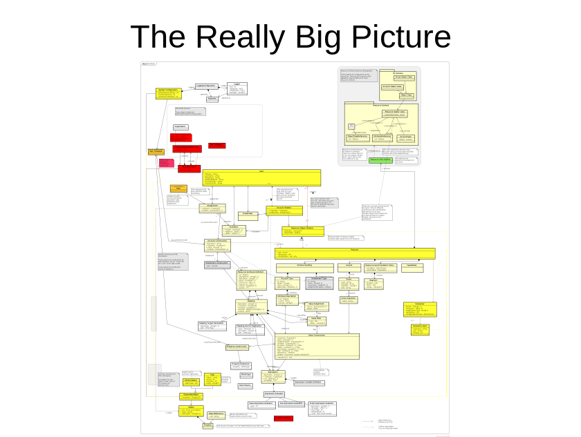
Figure 16. Really Big Picture (bad)
Select just the most important parts from the diagram and show only these:
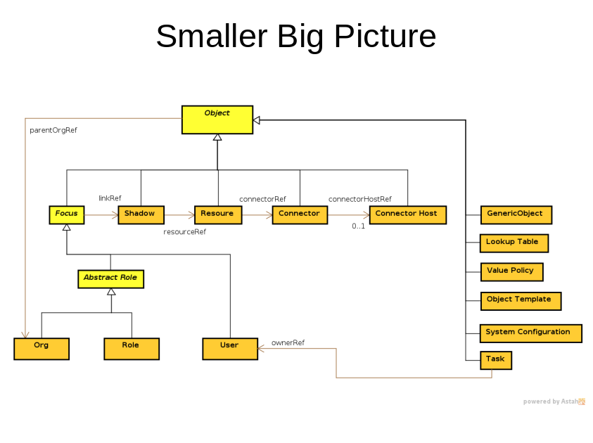
Figure 17. Smaller Big Picture (less bad)
However, this is still far from being perfect. The usual practice here is to use some pointer and walk the audience through the picture. This may actually work, depending on the type of audience and they how you present this. It is likely to work if you present for an audience that is already familiar with the diagram, such as your own team. If the audience is not familiar with the diagram, reserve quite a lot of time for the "walkthrough" and expect to answer questions during explanation.
However, a different type of diagram is needed to present to a more "generic" audience. Such diagrams are simpler, probably not completely formally correct. There are some generalizations, some details are missing. Goal of such diagrams is to illustrate a concept.
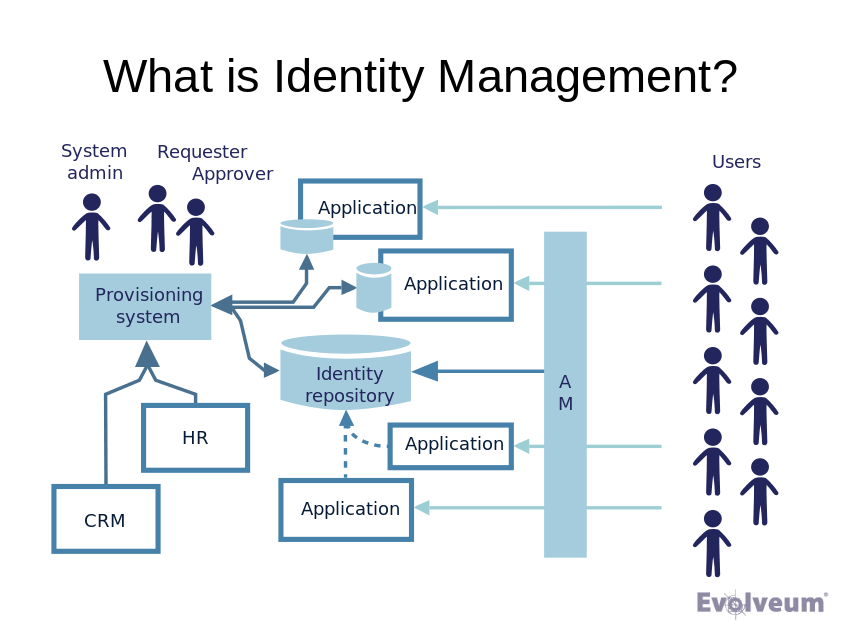
Figure 18. Conceptual diagram (good)
This diagram is still quite complex. And you will need to walk you audience through the diagram. But there are many repeating concepts (applications, users, databases). The audience should be able to understand the concept quite easily.
This approach also works for non-technology concepts:
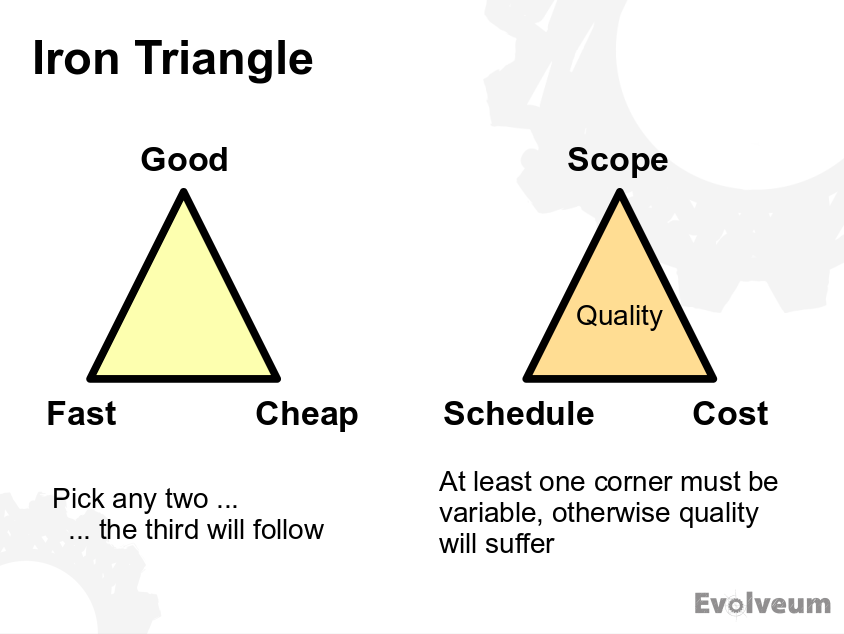
Figure 19. Non-technology concept
Visualization of the concepts makes it easier for your audience to understand. However, do not go too far into "conceptuality". This is not a marketing presentation. Avoid diagrams such as this one:
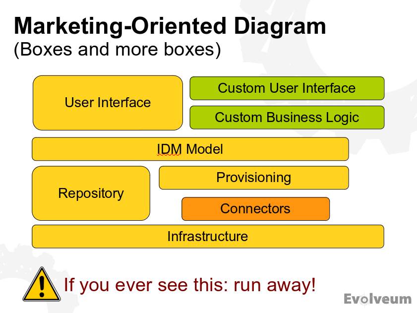
Figure 20. Marketing-oriented diagram (bad)
This diagram does not tell anything specific, but it is showing a lot of complex information to tell it. Such diagrams are almost everywhere and their purpose is to impress the audience without conveying any real understanding. The diagram shows components, but does not show their purpose, interactions or anything useful really. Even the layering is often creatively destroyed as the graphic designer transforms the diagram into corporate look and feel. Avoid this type of diragrams. Try to use a simplified variation of real component diagram instead:
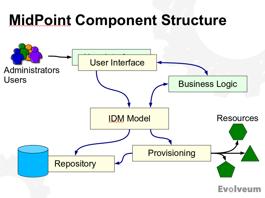
Figure 21. Component structure diagram (good)
This diagram shows the same thing as the "marketing" diagram above. However, it shows it in a way that is much cleaner, much easier to understand. It is obvious which components interact, where users connect, how the system relates to the outside world.
Sometimes you need to show a process or an interaction in your presentation. The method that immediately comes to mind is an animation. Animations are nice, attractive easy to understand when done well. The problem is that it is very difficult to do animation well. If you have the means to do good animations then go for it. However, this is beyond the means (and skill) of an ordinary engineer. Therefore I use a different approach.
A simple way how to illustrate a progression of steps is to use a series of pictures:
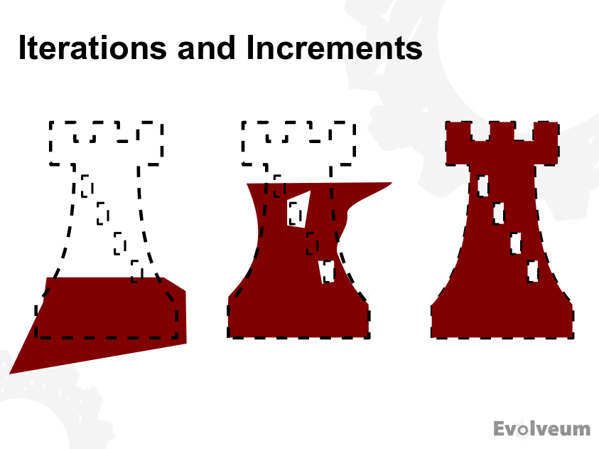
Figure 22. Sequence of steps (good)
This picture does not tell everything. It is not a standalone diagram. The audience will not be able to understand the idea by just looking at the picture. However, when you accompany the picture with the explanation of the process, the meaning becomes immediately clear. This works well for small and simple pictures. But sometimes there is a need to show a "story" using big diagrams. In that case I often use a sequence of several slides:
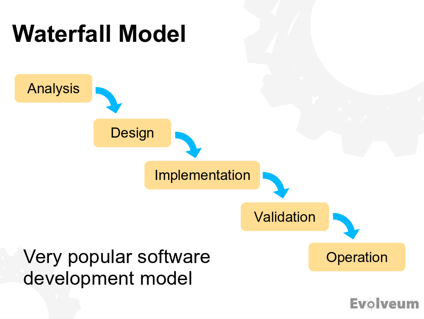
Figure 23. Story slide, part 1 (good)
Figure 24. Story slide, part 2 (good)
Figure 25. Story slide, part 3 (good)
When moving through the slides, this sequence works like a poor man’s animation. The last slide is obviously a bit over-the-top, and it certainly is not suitable for every occasion. But it entertains the audience and attracts attention. It is a nice way how to wake up audience that started to doze off, especially in a long lecture.
Let’s talk about the technical and "artistic" details of the diagrams. Being engineers, it would not be surprising if our artistic capabilities are limited - as is certainly obvious in my diagrams above. But we should make an effort to make the diagrams pretty anyway.
Most diagrams are big and complex. It is really necessary to scale the diagram to fill entire slide with it (perhaps except the title). That guy in the back of the room also wants to see all the details in the diagram. Zoom the diagram to fill the slide. This should go well if you have a reasonable master slide design. If your master slide contains a lot of marketing junk decorations, cover them up. Or start from blank slide master. I do not care what your corporate design manual says. If your designers did not include master slide for diagrams, your design manual is useless.
Use colors in your diagram. When used reasonably, colors make the diagram much easier to understand. The colors should not be used randomly. You should create a color code. E.g. use yellow for components that are part of your system, use green for external components, use blue for your dependencies and so on. Color code is very useful not just for diagrams in presentations. It is a great help for all the diagrams in your documentation.
Colors are great. However, it is difficult to choose the right colors that go well together. You may want to read up a bit on graphical design. Or perhaps you already have corporate design in place. However, there is one problem with corporate designs. Corporate designers will try to "monochromize" your diagram to match their corporate color scheme. Or the designers will try to apply consistent and pleasing colors to your diagram. However, they will completely ruin your color code in the process. Try to fight it. Diagrams that use reasonable colors are worth fighting for.
Make sure that you can edit the diagrams yourself when you create presentation. The diagrams always need adaptation to fit to the slide. The diagrams also need to be adapted for different purposes of the presentation. Maybe you want to highlight something on the diagram. Maybe you want to show just one part of it. Or maybe you want to integrate it into a larger diagram. Make sure you always have full control over the diagram. There are some corporate practices where a dedicated graphic designers create the diagrams. With all respect to graphic designers and all their skill, such diagrams are usually useless. Graphic designer does not know what you want to express. And the whole idea what a diagram should express is often developed as the diagram is created. Graphic designers just cannot do it.
Therefore use your favorite editor to create the diagrams (see also tooling section below). Just make sure your editor is compatible with the presentation tool and slide design. E.g. if the editor exports diagrams with white background, you have to use slides with white background. Dark slides, textured slides or even light gray slides will not work.
The importance of diagrams for technology presentations can hardly be overstated. Diagrams are the place where your message gets into the minds of your fellow engineers. Diagrams are what makes us understand. Therefore pay the attention to your diagrams, the diagrams more than deserve it.
Illustrations
Diagrams are technical drawings that usually have deep and complex meaning. On the other hand, illustrations are mostly just decorations. Theye there to appeal to emotions, to build the atmosphere, or simply to make slides pretty.
Illustrations are double-edged weapon. They are nice and may be helpful, but they may also be a distraction. The rule of the thumb is to use only those illustrations that support your message. Agenda slide that we have seen above is a nice example:
Figure 26. Good use of illustration in agenda slide
The slide is decorated with a picture of clipboard, supporting the idea of a strict agenda. This illustration also has an added effect to fill left-hand side of the slide that would otherwise be empty.
However, never use illustrations that do not support your message. Do not use generic illustrations that have nothing to do with your topic or the slide that you are presenting. These are just distractions. Visual junk. Do not use illustrations that are too generic, unless you really need to fill the slide. Generally speaking, illustrations are used very sparingly in technology presentations. And if they are used, they are usually given by corporate presentation templates.
If you choose to use illustrations, make sure you keep consistent style. Do not mix monochromatic sketches with colorful 3D pictures. Choose one style and stick to it. If you want to use simple 2D line drawings, use them everywhere. If you want to use isometric techno 3D illustrations, use them everywhere.
Avoid stock photos, especially photos of happy smiling managers. If you have to use stock photos, keep the same approach as with other illustrations. Use stock photos only if they have something to tell, if they are related to the topic of your presentation.
Just remember that when it comes to any decoration, less is more. There is nothing wrong if you try to make your slides beautiful. Just do not over do it. It is presentation content that is important, not the ornaments.
Code Listing
Technological presentation often contain code listings, parts of configuration files and data structure samples. Those are sometimes quite a bit pieces of text information. Remember that code listings are still texts. The mere fact that this is a code listing does not make it magically visible if you use font size 10. Stick to the general rules about texts in presentation. Keep the font size around 20 or 22. Maybe use size 18 if needed, but do not go smaller than that.
You may want to use monospace font for code listings. This looks nice, but more importantly it maintains indentation of the code. However, many monospace fonts are too thin to be clearly seen from the distance. Therefore consider using bold font to improve readability.
There are three important rules when it comes to displaying long code listings, configuration and similar big pieces of data: simplify, simplify and simplify. You do not nedd to show all the library import statements. You do not need to show all those XML namespace declarations. Nobody is going to copy&paste the code from your presentation. It is much more important to focus attention of the audience on the important parts of the listing. Therefore show only those parts, and perhaps some code around it to provide some context. Cut out everything that is not necessary.
My style is to use ellipsis (…) whenever there is something missing. I also use it to indicate that this piece of code was cut out from a bigger file. But the audience can usually figure that out even without that dot-dot-dot in place.
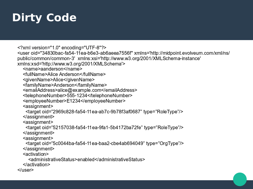
Figure 27. Dirty code (bad)
This is an awful slide. The listing is too long and complex. This is made worse by inappropriate slide design that does not leave enough space for content. The author had to reduce font size to fit everything in, resulting in undreadable text. To make things even worse, there is a lot of unimportant stuff in the code. The audience will have no idea where to look. The presenter will need to spend a lot of time explaining this code to the audience.
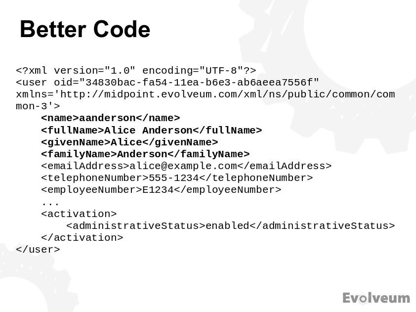
Figure 28. Better code (acceptable)
This is much better. More appropriate slide design was selected and there is more space available for content. Font size is now acceptable and monospace font makes it nicer. Unnecessary parts of the code were removed. The important part was highlighted. The audience can understand this slide almost immediately. But it can still be improved.
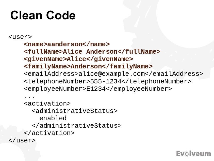
Figure 29. Clean code
This is nice and simple slide.
The <?xml…> prologue was removed as even a newbie can see that this is XML.
The namespace declarations were also removed as they are not important to understand the idea.
The code was reformatted slightly to allow for an even larger font.
Compare this clean code with a dirty code above and you will immediately see the difference.
It is also a good idea to add graphic elements into code listing, or to play with colors a bit. Maybe you want to focus attention to a particular part of the listing. Then you may highlight it in a different color. Or maybe change background color of that part. Or maybe add a rectangle around it. This approach helps, especially if you need to show a complex data structure.
Figure 30. Code listing with graphic elements
This slide is not perfect. The text is on boundary of readability. It goes above and beyond the "legal" area of the slide in quite an ugly way. But it shows a complex data structure and it is understandable. This is something that you can do if you have just a couple of minutes to create the slide. If you have more time and you want to create a better explanation of the concept it would be better to divide this slide to several separate slides, each one showing just one aspect of the data structure. But even though this slide is far from being ideal, it is a good illustration of the use of graphic elements to explain code listing.
Slide Background
Good graphic design of your slides is more important that it may seem. But probably not in a way that you expect. It is not that important for the design to be beautiful or impressive. This is not a business or sales presentation. The most important aspect of slide design for technological presenation is practicality. If the slide design is not right, they you spend a lot of time fighting the desing. You will waste precious time that could (and should!) be dedicated to creating presentation content.
However, the most important thing about slide design has almost nothing to do with graphics. The most important thing is this: Always use master slides. If you do not know what is master slide or slide master then go look it up. Now. And always use it. This is the only way how to create consistent presentations. It is also the only way how to create (and maintain) the presentation efficiently.
When it comes to slide decorations, less is more. Especially in technological presentations. The basic idea is that you want to leave as much space as possible for content. There will be big diagrams, there will be long listings, you want to make sure that there is enough space on the slide available for them. This is especially problematic if you use annoying corporate designs made for managers and business presentations. Such designs tend to overcrowd the slide with decorations and corporate mumbo-jumbo, leaving insufficient space for content. Talk to your graphic designer to make sure there is a dedicated master slide for diagrams. Such master slide should have only the very minimal decorations. If your graphic designer does not cooperate, create such slide yourself.

Figure 31. Corporate slide design (bad)
This is a real-world example from one of my early presentations in 2000s. I was a young engineer back then and I was told to use this insane corporate slide design. It has all the things that should not be in technological presentations: useless decorations, stock photo of smiling managers and vivid colors. I did what I was told, but I could not resist a little rebellion.
Figure 32. Modified corporate design (emergency solution)
There was no way how I could fit a good diagram in the corporate slide. Therefore I have modified the slide master and got rid of the decorations. This created something that was almost acceptable (for early 2000s standards).
We have already seen some good examples of slide design above. Like this one:
Figure 33. Minimal slide design (good)
This is an example of a slide master that was designed especially for diagram slides. It has ho decorations whatsoever, except the company logo. Even there, in hindsight, I would make the logo smaller if I could.
When selecting slide design, prefer white background. This works the best in most cases. Go with white background especially if you plan to copy&paste diagrams and charts from a third-party software tools. Many tools have problems exporting pictures with transparent background, and many presentation tools have problems propertly displaying them. White background makes this a lot easier. Even gray or lightly textured background may be a problem. Go for these only if you have tested that you can properly handle the transparent background problems. Dark slide background is usually an utter disaster.
Slide designs usually include logo of your organization, copyright, disclaimers and so on. Logo is all right, just make sure that it is small and neatly stowed somewhere in the corner. It should not attract too much attention, otherwise it will interfere with the content. The proper place where a logo should attract attention is title slide and closing slides of the presentation. If you are using personal introduction slide, that is also a good place for the logo. But emphasizing logo on each slide is just too showy, and it is almost always couter-productive. Copyright declaration on each slide is fine, just keep it short and small. The reason to have it on each slide is to discourage dishonest copy&pasters that do not like to give proper credit. Disclaimers and other legalities are a completely different matter. Disclaimer should not be on every slide. People are not going to read it anyway. If you want to satisfy your legal obligations or take cover, put disclaimer on title slide, agenda slide or closing slides. But not on every slide.
Slide numbers and presentation progress bars are a matter of taste. I do not use them. I do not see the point. But there is nothing inherently wrong with them if you like them.
Credit
Be a nice author and give credit where it is due. If you use information taken from other sources, give credit to that source. The credit should be placed right where the information is shown. E.g. if you use a table or a chart from a diffirent source, the least thing you can do is add small (but well readable) attribution. The attribution usually looks like "Source: Example, Inc.". If you are publishing slides in HTML or PDF form (as you should), you should make that attribution a clickable link.
If you are quoting (copy&pasting text from a different place), give credit to the source. If you tend to quote often, you should probably take the time to learn proper quoting etiquette.
Always respect copyright and trademarks. The fair use provision in copyright laws allows you to use the information that you need, as long as it is just a small portion of the work and you are using it properly and honestly. Prefer sources that use Creative Commons (CC) licenses. Creative commons provides licensing framework that is easy to understand. When in doubt, consult a lawyer or at least someone who knows the rules. If you are still not sure, it is better to use just your own work.
Whatever you do, always give credit if you reuse significant parts of other people’s work, even if the license does not require it. Giving credit is a basic politeness, it is really necessary part of good engineering practice.
Misc
There are some miscellaneous things that do not fall into any specific category.
Most presentation tools have ability to set up creative slide transition effects. Do not use them. The effects are usually annoying. They effect will just slow you down, especially if you have to back to some previous slide (which is quite common). The effects will not be visible in PDF version of the slides anyway.
Some presentation tools allow you to use animations. Animations may be useful to explain a process, they may illustrate how a network protocol works and so on. However, it takes a lot of time to create good animation. Huge amount of time, indeed. Unless you have that time, avoid use of animations.
Never use "illustrative" animations or videos in technological presentation. Those are animations that do not explain anything, they are there just for decoration. Such animations are a major distraction.
Animated icons are, thankfully, a thing of the past. But now there are memes and emojis. As a rule of the thumb, these belong to the same place as animated icons. Whatever that place is, it is not your technological presentation. If you really want to use memes, make sure they are relevant to your talk. Use them in moderation even then.
Presenting
The is the big moment. It is time to actually present your presentation, talk your talk, show your show. What should you do now? Perhaps the best thing would be to just start. Start is the most difficult thing to do. Everything else is easier.
Body Language and Voice
There are entire schools about body language and presenation soft skills. It may be interesting for you to check these out. However, this is technology presentation and you are an engineer. Nobody expects that you will be a celebrity showman. Most of the body language stuff is not really that important in your case. Just relax and be yourself.
However, there are few very useful things to remember:
-
Try to talk slowly. Many people have a habit to speak quickly if they are nervous. Relax, and slow down.
-
Speak clearly. Especially if you have an accent and there are non-native speakers in the room.
-
Speak loudly. Very loudly. Speak as loud as you can while still feeling comfortable. If you are in a big room, you do not have to be afraid of overdoig it. It is better to be too loud than to be too quiet. If your audience cannot hear you then your entire talk is useless. If there is a handheld microphone, make sure you talk to the microphone. In case you have clip-on microphone, you usually do not need to care about it at all. Just make sure it is turned on.
-
Try to work with the tone of your voice if you can. Emphasize important words. Try not to sound too boring. Otherwise the audience starts to fall asleep. Try to keep them awake with your voice.
-
Most importantly of all, talk to the audience. Always face the audience when you are talking. If you are pointing to something on the screen, stop talking for as long as your back is turned towards audience. If you do not have a microphone they will not hear you anyway. And even if you have microphone, it is not very polite to talk to people while they are looking at your back. Turn to face the audience, then continue talking. The best habit to learn is to never turn your back to the audience. Learn to point on the slides while you still face the audience.
Feedback
The very goal of your presentation is to get your message across to the audience. During your presentation, you should check whether you are successful at delivering the message. You should try to estimate whether the audience understands what you are talking about.
Watch your audience as you are presenting. Keep an eye contact. Find a few friendly faces in the audience. You will notice them, the people that are interested, listen closely, they nod, smile or frown occasionally. Talk to them. Try to slow down and re-phrase what you are saying if they look puzzled. Try to speed up or improvise if they look bored. Adapt your presentation to the audience.
Do not be afraid to get back to a previous slide if you need to. Presentation is not a one-way street, it is an interactive session. Do anything your audience needs to understand your message.
Do not let your audience fall asleep. The longer the talk is, the harder it will be to maintain attention of the audience. If you notice that their attention is falling, try to do something unexpected or interesting. Use (appropriate) humor, surprise them, make a reference to current affairs, do something re-gain their attention.
You will notice that it was too much if the audience looks tired. Slow down. If it is a long lecture, this is the appropriate time for coffee break. If it does not help, then maybe even stop the presentation, start discussion and improvise.
There will always be some people that will not listen. Do not care about them too much. Your goal is to deliver your message to those that are willing to listen. That will usually be roughly 80% of the audience. If you can get the message to them, that is good enough.
This kind of feedback is what I miss in on-line presentations.
Improvisation
You are making a presentation, not recording a video. The whole point of live presentation is interactivity. Therefore be prepared to adapt to the situation at hand. Be prepared to improvise. Even be prepared to discard your well-prepared presentation and improvise if it turns our your assumptions about audience were wrong. Be prepared for everything.
It is always a good idea to have whiteboard or flipchat in the room. Even the best presentation with many backup slides will not prepare you for all the situations and audience questions. As this is a technology presentation, answering a question often involves whiteboard drawings. These are quite difficult to do if there is no whiteboard around.
Do not be afraid to improvise. Nobody knows what you have planned for the talk. The audience cannot distinguish what was planned and what was improvised.
Demo
Live demos are often part of technology presentations. And in fact, they usually make the most interesting part.
However, performing a live demo can be quite demanding and risky. Demos often fail. As you are an engineer, you are probably well familiar with Murphy’s laws. Therefore the demo needs careful preparation. Try all the scenarios before presentation. Write down the scenarios on paper, or prepare a slide for each scenario. It is easy to forget an important step in live demo, or even miss a whole scenario.
Do not improvise in the demo if you do not have to. Especially if there are important people in the audience. Even if you are confident the software works, your configuration is robust and the network works, the demo can still fail. You will be under a lot of pressure, which makes you the weakest link in the chain. Try all the scenarios before the demo and do not deviate from them.
If you are not certain the demo will work, it may be a good idea to prepare some screenshots. The screenshots are sill better than nothing.
If you show parts of the demo in a terminal window or text editor, make sure the font is readable. Your default terminal is probably dark background and small font. That won’t be readable in big room. The only thing the people in the back will see are tiny beetles moving around dark screen. It is a good idea to prepare terminal profile with white background and big bold font. For text editors and browser learn keyboard shortcuts to quickly adjust font size.
It may be a good idea to ask another person to do the demo. You will have a million of things going on in your head during the presentation. The other person can focus just on the demo. It is less likely to make a mistake if you divide the responsibilities.
Duration Control
It is absolutely essential not to exceed the time slot that you have for your presentation. The best strategy is in preparation. Prepare appropriate amount of material, just enough slides to fill your time slot. Know yourself, know how long it takes for you to present the slides. This is the best mechanism, because you do not need to think about it. But it requires some experience.
Most presentation tools provide an integrated "presenter screen" with a timer. This may be useful. But I usually do not rely on that. If you stop the presentation to show something in a terminal or to do a demo, the timer resets.
A primitive, but still quite efficient method is to just use your wristwatch. However, it find it difficult to compute how much time I have available while still talking. If I’m not certain about my timing, I usually use a stopwatch app on my mobile phone. I put the phone on the table where I can clearly see it and I start the stopwatch just before the presentation starts. That immediately shows me how long I’ve been talking.
Some conference organizers have a people in the front row that will show you a card with "10 minutes" or "5 minutes" if you are running out of time. If the conference organizer does not provide this and you have trouble keeping the time, you can ask a colleague to show the cards for you.
Discussion
Presentations are supposed to be interactive, and discussions are a essential part of that interactivity. There are two approaches to discussion and questions:
-
Allow questions any time during presentation. This works well for smaller audiences, but you need to be prepared to handle the discussions and improvise. However, the discussions are better as they tend to be targeted to the thing you are just presenting. It is also an excellent feedback, you will immediately know how the audience understands what you are saying. This is my favorite method and I try to do it anytime I can.
-
Allow questions after the presentation. This works well for a large audience, or very diverse audience. It is easy to miss a question during a presentation in a big room. Also, the people will need a microphone for you to even hear the questions. In such cases it is much easier to take the question at the end of presentation. However, you will miss the immediate feedback during presentation and the talk will be much less interactive.
I usually try to do both if I can. I encourage the audience to ask question during the talk (if the environment allows it). The I explicitly ask whether there are any more questions at the end of presentation. But you have to find your own style here.
It is a good idea to create a dedicated "Discussion" or "Questions & answers" slide just before the presentation end. This will make you remember to ask for questions.
Try to prepare for the discussion. Think about the things that the people are likely to ask about. If there is any deeper information, try to prepare backup slides with that information. This is important especially if you need a complex diagram to answer a question. Make sure the diagram is in your backup slides.
While answering a question, try to provide short and specific answers. The purpose of discussion is short clarification, it is not an excuse to continue your talk. You will certainly have a limited time to answer the questions.
Watch the time and do not exceed your time slot, even if the discussion is interesting. Especially if you are at the conference and there are other presentations starting right after. If you want to continue discussion, ask the interested people to continue in the lobby or other suitable place.
Always pay attention to the instructions from talk organizers. If the talk is recorded, you may need to repeat the questions from the audience to get them to the recording. Or you may need to wait until a microphone is delivered to the audience before a question can be asked.
Do not be afraid of the discussion. If you are an expert on the topic that you are presenting, you will have no problems answering the questions. If you are not an expert, you probably wouldn’t present the topic at all, would you? If you still feel uncertain, ask a more experienced colleague to be in the audience. If the questions get tough, you can ask your colleague to answer that question. However, it is very unlikely that you will ever need to resort to that. The very presence of an experienced colleague in the audience will give you all the confidence to answer all the questions yourself.
Wrapping Up
That’s it. You have done it. Just remember to thank the audience for their time and attention.
Do not run away immediately after the talk. Be prepared to answer more questions after the presentation. If your presentation was interesting, the probably there will be people discussing the topic with you during coffee breaks and evening events. Do not hide in the corners, make sure you are available for such discussion.
On-Line Presentations
On-line presentations are essentially the same as in-person talks, except that they are completely different.
The same rules about minimal slide design and text sizes remain. You do not want the audience to have their noses stuck to displays. You do not want them to read long epic texts in your presentation.
Make sure you test the teleconference software before the presentation. Most tools offer testing rooms or some kind of free service. Ask a colleague to help you test the tool, especially if the tool is new to you or you have not used it for a longer time. Make sure you test that your voice is loud and clear. Explicitly ask your colleague whether they can hear you clearly. Test screen sharing functions, both for the slides and the demo. Learn the functions to mute/unmute audience. You may need to mute audience in case that someone from the audience is producing a noise. If your teleconferencing software allows it, set your audience to be muted by default. You may need to unmute them for questions/discussion.
Built-in microphone in your notebook is not good enough. Especially if you plan a demo. The audience will hear you typing on a keyboard. Have a headset or good teleconferencing device. This is very important. Headset is easy to use, just make sure the microphone is in correct position. However, use of teleconferencing devices requires experience. There is likely to be an echo, it can catch outside noises and so on. Your voice will be very quiet as long as you move away or turn your head. Headset is much preferred, unless you are a real pro. Even though I have plenty of experience with on-line work, I still prefer a headset.
Speak loudly, even if there is a microphone close to your mouth. The audience may have various volume settings. They may have already maxed out their volume, but it may still not be enough to hear you clearly. The audience may be in noisy environments. Your presentation may even be projected on a big screen and your voice reproduced from loudspeakers. Loud signal can easily be made quieter. But it is quite difficult to amplify a weak signal as the result is likely to be very noisy.
Mute your microphone if you are not talking for a longer time. This is unlikely to happen if you are presenting solo. If this is a pair/group presentation, mute your microphone when you colleagues are talking. This eliminates the noises.
Turn on your camera whenever you can. It will be much better for the audience to see you, even it is just a small picture of your face in the corner.
You will probably not see your audience. That is the dark side of on-line presentations and it needs some time to get used to. Try alternative ways how to get feedback. Maybe you want to explicitly ask whether the audience has some questions at appropriate places in the presentation. Some conference software allows interactive polls. You have to be creative.
Avoid animations and videos in your presentation. Teleconferencing tools are not well suited to convey them to the audience. The video will look bad, animations will not be smooth. This can ruin the impression entirely.
On-line discussions are quite difficult to manage and the audience will be probably too shy to speak up. Therefore most presentations resort to chat for asking questions. Ask the audience to write down any questions into a chat window. Most teleconferencing software have them. Some teleconferencing tools have a means for an audience to "raise hand". You may want to use it. However, it is quite easy to miss the "raised hand", especially if the audience is large. Having another person to "manage the audience" can help. That person can for questions and "raised hands", remanding you.
Techniques
This section is about the tooling and techniques that will help you make your presentation.
Preparation Time
Preparation is critical for presentation success. However, not all presentations are created equal. There are important presentations. Maybe you are presenting to the board, or to the committee that can approve or deny funding for your project. You would gladly spend days or even weeks to prepare for these as failure can have severe consequences. Then there are casual presentations. These are mostly for fun and there is no really bad consequence to failing there. You probably want to prepare such presentations as quickly as possible. Preparation time is an important concern.
Make your presentation good enough. Do not try to make it perfect. You will need infinite time to make it perfect. Good enough is enough. As you can see, my slides are not perfect either. However, most of my presentations worked like a charm.
Make sure you adapt your behavior to the importance of the presentation: your preparation process, tooling, reharsing and all the other things that you are doing. Do not try to prepare for all presentation in the same way. That would mean spending too much on unimportant talks and you will not have enough time for really important ones. Make sure that your tools are efficient.
Tooling
When it comes to presentations, PowerPoint is the king. There is nothing wrong using PowerPoint if it works for you. However, you are an engineer. Chances are you may be running on Linux desktop. I’m running on UNIX desktops for two decades. I tried to use variety of tools, but I always end up with LibreOffice Impress (and OpenOffice before that and StarOffice before that). Impress is not a perfect tool, but it is good enough. Pretty much all my presentations were made in Impress.
There are also some on-line presentation tools. I din’t really like such tool, but you might like them. If you are going to use on-line tool, just make sure you also have off-line version of your presentation. Even though Internet is everywhere now, WiFi connection in a big room with huge number of mobile devices and notebooks may not be entirely reliable. You do not want to bet your entire presentation on that.
Whatever tool you are going to use, always use master slides. Always. Even for trivial three-slide lightning talk. This will save you huge amount of work in the long run. Slides are often re-used, modified, you will want to use some parts of the talk that you had 2 years ago in tommorow’s talk. Being able to copy&paste slides and quickly adjust the design is just priceless.
What about slide size? Should you go for 4:3 or 16:9 aspect ratio? That is still quite a difficult question. The trend is clearly towards 16:9 slides. However, there is still a bunch of old projectors out there, and these are 4:3. If you present your 4:3 presentation on 16:9 projector it will look funny, like a miniature of a presentation. Good conference organizers will let you know about the technical details, including recommended presentation aspect ratio. If you are not sure, you can always ask the organizer. Modern conference venues are likely to have 16:9 machines. Older premises may still have old 4:3 projectors. If you still do not know, I would say 4:3 is a more conservative option. Presentation made on 4:3 slides looks acceptably well on 16:9 projector. However, 16:9 slides look ridiculous on 4:3 projector. Whatever you decide, make your decision before you start to create the slides. Changing slide aspect ratio is really difficult. It usually means that you need to redo (or at least touch up) all your slides.
When I’m preparing a presentation, I usually start with agenda slide, or empty slides that represent important parts of my presentation.
Then I’m adding the content in an iterative fashion.
I’m trying to create the presentation in a chronological order: creating introduction first and conslusion last.
That is the way how audience will see it, and that is the best way to make sure the presentation looks like a consistent story.
However, I tend to skip back and forth quite often, writing down remarks, adding placeholders and so on.
If you do it like me, it may be difficult not to get lost.
Therefore I have a habit to put text TODO at all places that are not complete.
When I think that I’m done with the presentation I can search the entire presentation for string TODO.
That will immediately point me to the unfinished parts.
If you are presenting from your own computer, make sure you have a backup of your presentation on a different machine. You know, Murphy’s laws. Copy the presentation on USB key or publish it on-line. The best approach is to publish a PDF export of your presentation (see below). PDF is quite universal, almost all the devices can display it. In case that your computer fails, you can borrow someone else’s machine and show the PDF without any problems.
Also, make sure that your computer can connect to HDMI. If your machine does not have HDMI output, bring an adapter. Test the HDMI output and the adapter before you leave. If you are presenting in an older venue, it may be good idea to bring VGA (D-Sub) adapter as well.
Rehearsing
If you are not certain about yourself, it may be good idea to talk your talk before you actually talk your talk. Rehearsing your presentation may help you to relax and gain self-confidence.
You should consider rehearsing the presentation if:
-
You do not have enough presentation experience.
-
You have stage fright and rehearsing helps you relax.
-
You are co-presenting with another person - unless you know that person so well that you can finish each other’s sentences
-
It is a very important presentation where every word matters.
-
It is a very short time-boxed presentation.
If you do rehearse, try to have an audience. Ask a colleague or a friend. The audience does not need to have any knowledge of the topic. If you cannot get people as audience, dogs usually work well. Not the cats, though. Only master presenters can keep attention of a cat for long enough. Even inanimate objects work as rehearsing audience. Rubber duck is a traditional choice for an engineer. Just make sure you choose something that has eyes. It is difficult to keep eye contact if the eyes are not there.
If you rehearse, make sure to set up a timer. Rehearsing is a great way to validate your timing. Just make sure you speak slowly and do not skip anything.
Rehearsing is completely optional. I usually do not rehearse at all. I would rather spend the time on good overall preparation of presentation materials. However, if you feel that rehearsing will help you, you should definitely try it.
Publishing
Whenever you can, publish your presentation. Publish it on your personal site, blog, company site, public slide sharing sites or anywhere you want to. Just publish it, so the information can be shared.
Export the presentation to PDF and HTML.
You should choose a tool that has that option.
There is no point publishing *.ppt or *.odp files, unless you expect other people to modify your presentation.
PowerPoint files are useless to me as I’m not willing to install MS PowerPoint to see your presentation.
And my LibreOffice is likely to ruin your slides.
Similarly, OpenDocument files are (sadly) useless in Microsoft world.
PDF or HTML is just fine.
If you can, publish slides BEFORE presentation. Ideally before you leave your home. You do not need to make URL public, but remember the URL a make is accessible. This is a form of backup if your computer dies or anything else goes wrong.
Keep a list of your presentations. See my presentation list as an example. This is good for your career. Also, it is good to have it when you will get older and your memory will not be as vivid as it is today. It is also a good idea to keep a list of talks for your comapany.
Conclusion
That’s it. Now you should be prepared to start working on your presentation. However, do not take this guide literally. You probably won’t agree with me on everything. That is fine with me. Adjust your practices as necessary. Presenting is an art form and everybody has its own style. It would be a boring world if all the presentations looked the same.
Author and Origins
I’m a professional software developer and architect for more than two decades. I have done a lot of talks during the years. There always was this tention between business-oriented and engineering-oriented approach. The common presentation techniques are usualy business-oriented, but that thas not work that well for engineering.
Then there are young engineers that often do not get any format training in presentation techniques at all. However, they have a lot to say to the community. It is quite obvious, that they would benefit from a good presentaion guide.
In fact, this document is an updated and (hugely) expanded version of a short HOWTO that I have created back in 2002 for our local Linux User Group (SkLUG). This was done precisely with the goal of helping young engineers to improve their presentations. The HOWTO was very useful back then. I was quite surprised to realize, that it is still useful, almost two decades later. Therefore, here it is. I hope that it will be helpful.